Google Gemini Simplifies Data Visualization in Workspace for Faster Insights
Generate complex charts directly in Workspace, simplifying data interpretation and saving 30 minutes per report.
What matters today
Generate complex charts directly in Workspace, simplifying data interpretation and saving 30 minutes per report.
Key points
- Google Gemini Simplifies Data Visualization in Workspace for Faster Insights
- Streamlining Data-to-Insight Workflows with Gemini
- The Workflow: From Raw Data to Insightful Visuals
- Real-World Application: Quarterly Sales Performance Review
What you will learn in this article:
- How to quickly transform raw data into insightful visuals for executive presentations.
- How to reduce report generation time by an estimated 30 minutes per data analysis.
- How to improve decision-making accuracy with clearer, AI-generated data interpretation.
- How to integrate advanced charting directly into existing Google Workspace workflows.
Google Gemini Simplifies Data Visualization in Workspace for Faster Insights
A Chief Marketing Officer at a growing B2B SaaS company faces a recurring challenge: preparing monthly performance reports for the board. Each report requires compiling data from various sources,CRM, ad platforms, website analytics,into comprehensive visuals. Historically, this meant exporting raw data into spreadsheets, manually creating charts, and then painstakingly transferring them into presentation slides. This process consumed hours, often leading to late nights and a frantic scramble to ensure accuracy and visual appeal. The manual effort also risked introducing errors, potentially misrepresenting critical campaign performance or market trends.
The stakes are high. Delayed or unclear data visualizations can lead to missed opportunities, misinformed strategic decisions, and a lack of confidence from stakeholders. Executives rely on clear, concise data to guide their teams and allocate resources effectively. Without an efficient way to translate complex datasets into actionable insights, an organization risks falling behind competitors, failing to adapt to market shifts, or overlooking critical operational bottlenecks. The time spent on manual chart creation is time diverted from strategic thinking and proactive problem-solving.
This article details how Google Gemini's new advanced data visualization capabilities within Workspace directly address these challenges. It outlines a streamlined approach to generate complex charts and graphs directly from your data, accelerating report creation and enhancing the clarity of your insights. Discover how this integration saves your team valuable time and elevates the quality of your executive communications.
Streamlining Data-to-Insight Workflows with Gemini
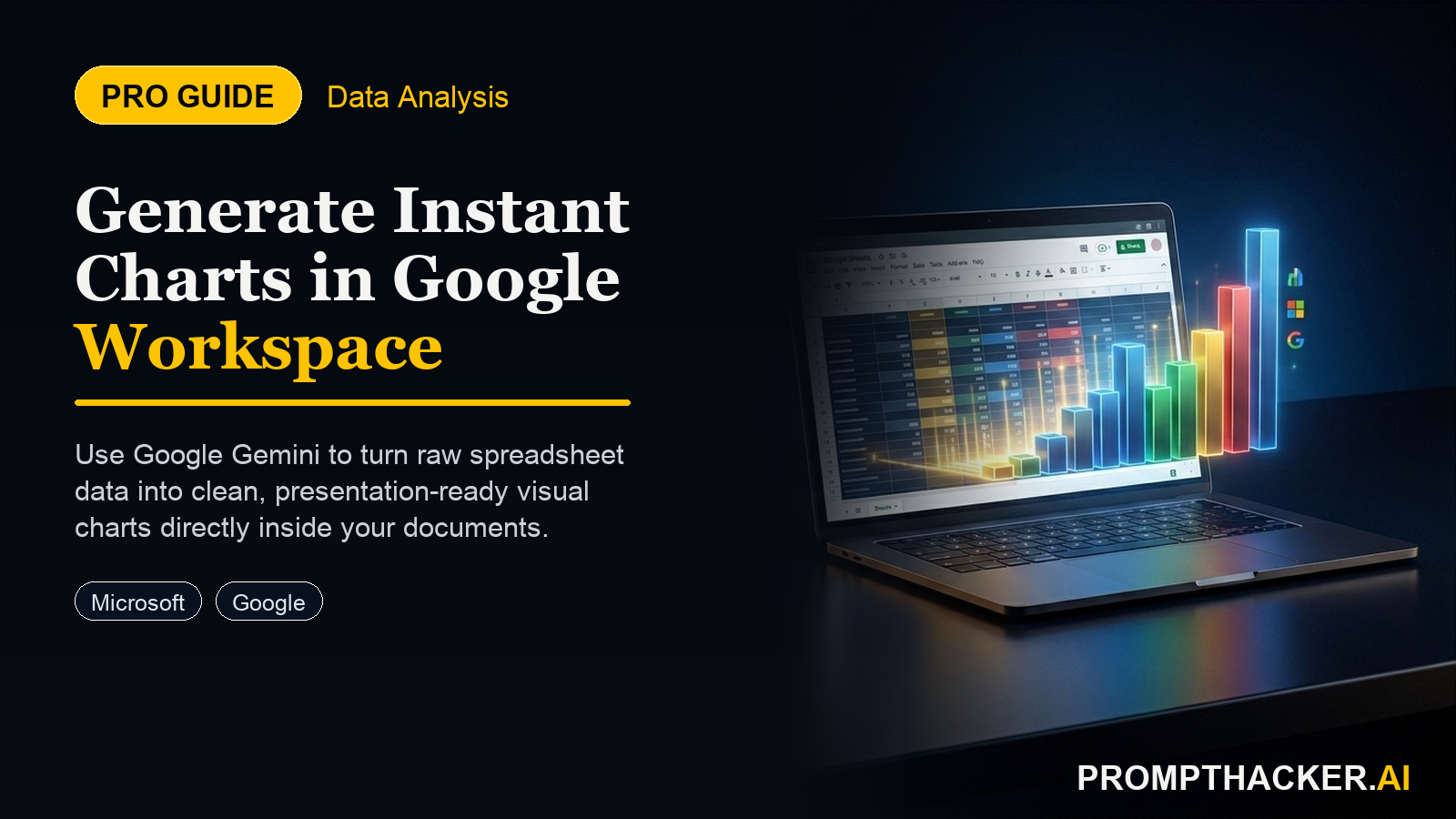
Google Gemini's introduction of advanced data visualization within Workspace marks a significant step forward for any organization relying on data for decision-making. Launched on January 12, 2025, this capability allows users to generate complex charts and graphs directly from their data, eliminating the need for external tools or extensive manual manipulation. The core benefit is a streamlined workflow that transforms raw numbers into clear, actionable visuals with unprecedented speed. An estimated 30 minutes can be saved per data analysis report, allowing teams to focus on interpretation rather than creation.
This new feature empowers business executives to derive insights faster and communicate them more effectively. Consider a financial analyst tasked with visualizing quarterly earnings trends, product line profitability, and regional sales performance. Previously, this might involve exporting data from a financial system into Google Sheets, then manually selecting data ranges, choosing chart types, and adjusting formatting within Sheets or transferring to Google Slides. Now, Gemini integrates directly into this process, intelligently assisting in the creation of sophisticated visualizations.
The "advanced" aspect means more than just basic bar or pie charts. Gemini can interpret the context of your data, suggest appropriate visualization types, and even generate complex charts like scatter plots, heat maps, or dynamic trend lines that reveal deeper patterns. This is particularly valuable when dealing with large datasets where manual exploration might overlook subtle correlations or anomalies.
The Workflow: From Raw Data to Insightful Visuals
Implementing Gemini's advanced data visualization involves a series of steps that integrate seamlessly into existing Google Workspace habits. This workflow is designed to reduce the friction between data collection and data presentation.
1. Data Preparation within Google Sheets
The foundation of any effective visualization is clean, well-structured data. Before initiating Gemini's capabilities, ensure your data in Google Sheets is organized. This means:
- Consistent Formatting: Use uniform date formats, currency symbols, and numerical representations.
- Clear Headers: Each column should have a distinct, descriptive header.
- No Gaps: Fill in any missing data points or denote them appropriately.
While Gemini can handle some data interpretation, starting with clean data ensures the most accurate and relevant visualizations. For example, a marketing team analyzing campaign data should ensure that metrics like "impressions," "clicks," and "conversions" are in separate, clearly labeled columns.
2. Initiating Visualization via Gemini
Once your data is prepared in Google Sheets, you can invoke Gemini's visualization capabilities. This typically happens in one of two ways:
- Direct Selection and Context Menu: Select the data range you wish to visualize within Google Sheets. A new "Visualize with Gemini" option will appear in the right-click context menu or in the Gemini sidebar.
- Prompting in Google Docs or Slides: If you are working in Google Docs or Slides, you can prompt Gemini directly, referencing your Google Sheet. For example, you might type:
EXAMPLE PROMPT
"Gemini, create a bar chart from 'Q4 Sales Data' showing regional performance by product category."
Gemini will then access the linked sheet and begin the visualization process.
This direct integration eliminates the need to copy-paste data into a separate charting tool, saving time and reducing potential errors.
3. Leveraging Gemini's Intelligence for Chart Generation
This is where Gemini's AI capabilities provide significant value. Upon initiation, Gemini will analyze your selected data and offer suggestions for appropriate chart types based on the data's nature.
- AI-Powered Suggestions: If you have time-series data, Gemini might suggest a line graph. For categorical comparisons, bar charts or pie charts could be proposed. For relationships between two variables, a scatter plot might appear.
- Natural Language Requests: You can refine Gemini's suggestions or make specific requests using natural language. For example,
EXAMPLE PROMPT
"Show me the top 5 performing products by revenue"
or
EXAMPLE PROMPT
"Visualize the correlation between marketing spend and customer acquisition cost."
Gemini understands these commands and generates the corresponding charts.
This intelligent assistance means you do not need to be a data visualization expert to create sophisticated charts. Gemini guides you toward the most effective visual representation for your data story.
4. Customization and Refinement
Once Gemini generates an initial chart, you can customize it to match your organization's branding or specific presentation needs.
- Aesthetic Adjustments: Modify colors, fonts, and background styles.
- Labeling and Annotations: Add clear titles, axis labels, data labels, and annotations to highlight key data points or trends.
- Filtering and Aggregation: Adjust the data displayed by applying filters or changing aggregation methods directly within the visualization interface.
This step ensures that the generated charts are not just accurate, but also visually impactful and aligned with your communication objectives.
5. Integration into Workspace Documents
The final step involves embedding your newly created, advanced visualizations into your Google Docs or Google Slides.
- Dynamic Embedding: Charts generated by Gemini can be dynamically linked to your original Google Sheet. This means if the underlying data in the Sheet changes, the chart in your document or presentation updates automatically. This feature is critical for live dashboards or reports that require frequent updates.
- Static Embedding: For reports where data will not change, you can also embed a static image of the chart.
This seamless integration maintains data consistency and saves significant time that would otherwise be spent manually updating charts across different documents.
Real-World Application: Quarterly Sales Performance Review
Consider a Head of Sales at a national distribution company preparing for the quarterly executive review. The goal is to present regional sales performance, identify top-selling product categories, and illustrate year-over-year growth.
The Old Way:
The sales team would export raw sales data from their CRM into a Google Sheet. The Head of Sales or an assistant would then spend hours manually creating separate bar charts for regional performance, pie charts for product category distribution, and line graphs for YOY growth. Each chart would require careful data selection, formatting, and then manual insertion into a Google Slides presentation. Any last-minute data updates meant repeating large portions of this laborious process, potentially introducing errors under pressure. This often consumed an entire day, pulling the executive away from strategic planning.
The New Way with Google Gemini:
- Data Consolidation: The sales team exports raw sales data into a Google Sheet, ensuring columns are clearly labeled (e.g., "Region," "Product Category," "Revenue," "Date").
- Initiate Visualization: The Head of Sales opens the Google Slides presentation and, within a new slide, uses the Gemini sidebar. A prompt such as,
Three deep dives. Four useful moves. One email worth opening.
PromptHacker turns the AI firehose into practical next steps for work, health, family, and everything time keeps trying to steal.