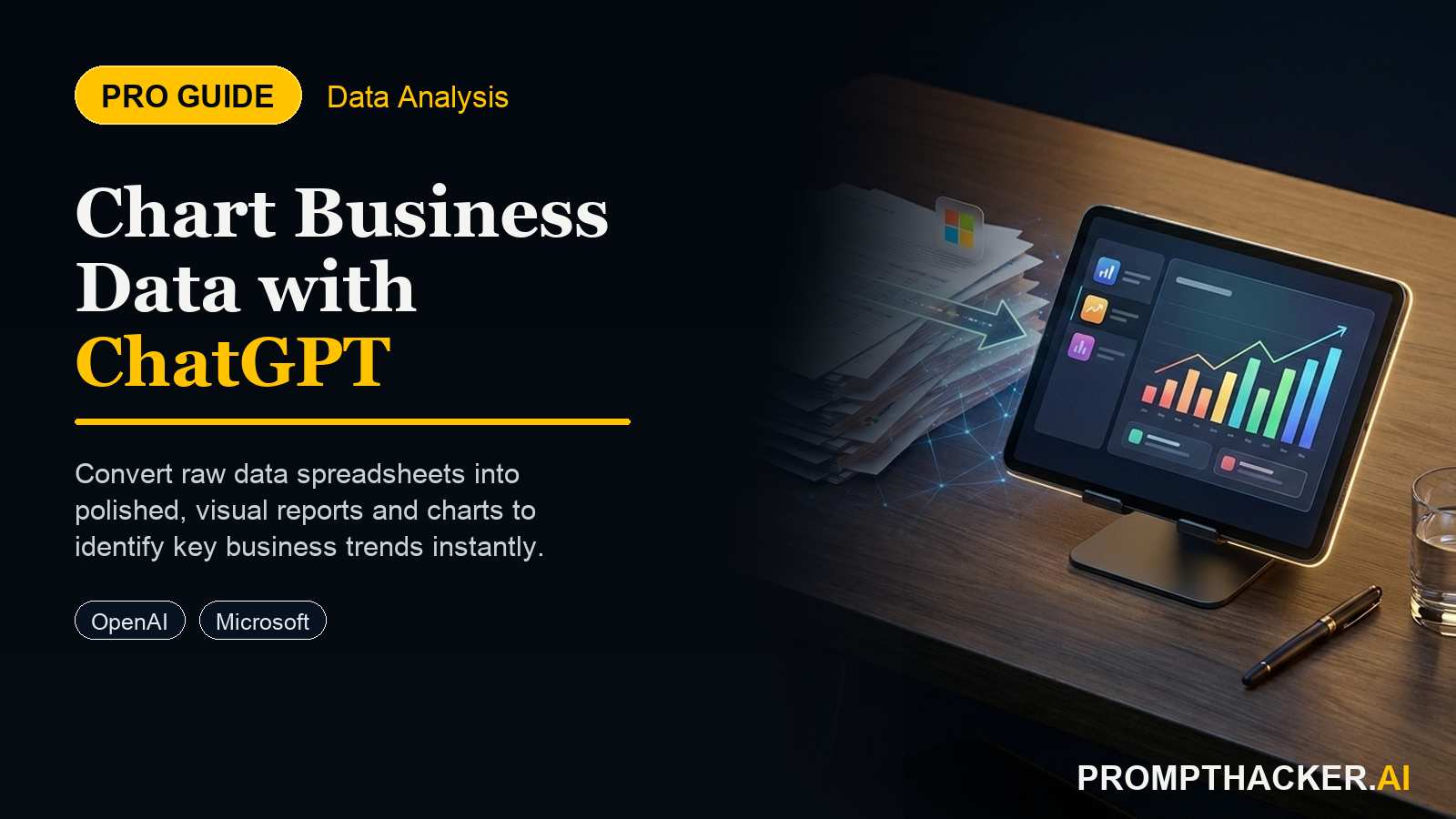
ChatGPT Plus: Advanced Charting Visualizes Business Data Faster
Use ChatGPT Plus to quickly generate visual reports from your raw data, identifying key business trends faster.
What matters today
Use ChatGPT Plus to quickly generate visual reports from your raw data, identifying key business trends faster.
Key points
- 1. Prepare Your Data for Optimal Visualization
- 2. Upload and Initiate Analysis with a Clear Goal
What you will learn in this article:
- How to prepare your raw business data for optimal visualization within ChatGPT Plus.
- How to generate diverse chart types, including bar, line, and scatter plots, to illustrate complex metrics.
- How to refine and interact with AI-generated visual reports to gain deeper strategic insights.
- How to troubleshoot common data formatting issues that hinder effective charting and analysis.
A Head of Product at a rapidly scaling SaaS company faces a recurring challenge. Each quarter, they gather vast amounts of user engagement data: monthly active users per feature, average session duration, and feature-specific churn rates. Consolidating this raw data into clear, actionable charts for the executive team demands hours of manual effort, often involving multiple spreadsheet applications and design tools. This process is not only time-consuming but also introduces potential for errors, delaying critical product development decisions.
Without efficient data visualization, the executive team struggles to quickly grasp feature performance, identify underutilized aspects, or pinpoint areas driving user churn. This lack of immediate insight can lead to misallocated resources, delayed feature rollouts, and missed opportunities to retain valuable customers. Manual reporting cycles slow down the entire product strategy, impacting growth and market responsiveness.
This article details how the new advanced charting capabilities in ChatGPT Plus can transform raw product data into precise, insightful visual reports within minutes. Executives can learn to leverage AI to automate data visualization, accelerate trend identification, and present compelling, data-backed strategic recommendations, moving beyond manual processes and into rapid, intelligent decision-making.
The ability to translate complex datasets into digestible visual reports is a cornerstone of effective executive decision-making. OpenAI's ChatGPT Plus now offers advanced charting, enabling executives to rapidly generate sophisticated visualizations directly from their raw business data. This enhancement allows for faster trend identification, improved data interpretation, and more agile strategic responses without the need for specialized data analysis software or extensive manual effort.
This capability is particularly beneficial for executives who regularly analyze performance metrics, market trends, or operational efficiencies. Instead of spending hours manipulating spreadsheets and building charts, a few targeted prompts can yield comprehensive visual summaries. The following steps outline how to effectively use ChatGPT Plus for advanced charting, complete with a practical example and troubleshooting tips.
Time to value: 7 minutes for initial chart generation.
1. Prepare Your Data for Optimal Visualization
The success of any AI-driven data visualization hinges on the quality and format of your input data. ChatGPT Plus works best with structured, clean data, typically in a tabular format.
- Format Matters: Prefer CSV (Comma Separated Values) or Excel files (.xlsx). These formats clearly delineate columns and rows, making it easier for the AI to parse the information. Text files with consistent delimiters (like tabs or pipes) can also work but require more precise instructions.
- Cleanliness is Key: Ensure your data is free from extraneous characters, merged cells, or inconsistent data types within a single column. For example, a "Sales Revenue" column should contain only numerical values, not text like "N/A" or currency symbols.
- Clear Headers: Use descriptive column headers (e.g., "Monthly Active Users," "Average Session Duration (minutes)," "Churn Rate (%)"). Ambiguous headers can lead to misinterpretations by the AI.
- Data Volume: While ChatGPT Plus can handle substantial datasets, starting with a manageable size (e.g., a few thousand rows) is advisable for initial testing and understanding its capabilities. Extremely large files might exceed processing limits or introduce delays.
Why this step is critical:
Poorly formatted data is the most common reason for inaccurate or failed chart generation. Investing a few minutes in data preparation saves significant time later in the process and ensures reliable insights.
2. Upload and Initiate Analysis with a Clear Goal
Once your data is prepared, the next step involves uploading it to ChatGPT Plus and providing an initial prompt that clearly states your objective. This sets the context for the AI's analysis and chart generation.
- Upload the File: Use the attachment icon (paperclip) in the ChatGPT Plus interface to upload your CSV or Excel file.
- Initial Prompt: Begin with a prompt that describes the data and your overarching goal. For example, if you are a Head of Product analyzing user engagement:
Three deep dives. Four useful moves. One email worth opening.
PromptHacker turns the AI firehose into practical next steps for work, health, family, and everything time keeps trying to steal.